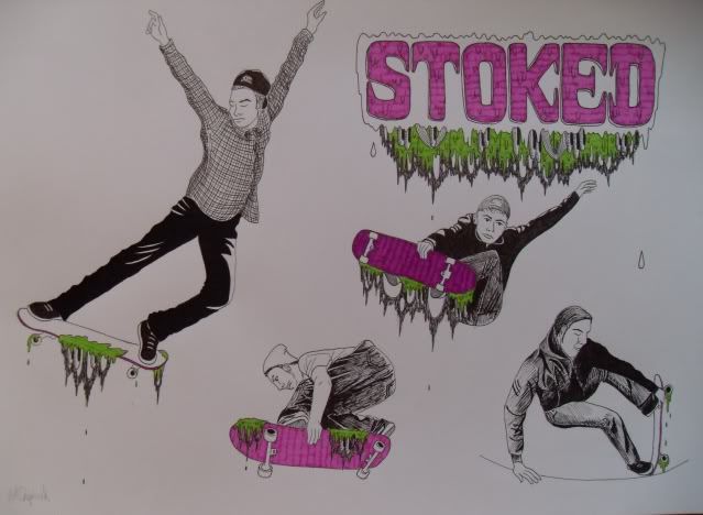
I am learning to skateboard, but it isn't going very well so I resort to drawing people who can skate amazingly
Alex Spiro
I found this on the Nobrow site and was instantly drawn to it. I like the ‘creases’ in the print because it gives this rough and ‘vintage’ quality, juxtaposed to the modern colours and the clean-cut graphic style of the poster. It reminds me of both Rock Posters from the 70’s and horror B movie posters of the 80’s, of which both I like.
I am currently practising drawing faces in a Marvel comic book style and this lady’s face reminds me of that style with her high cheekbones, clumped lashes and seducing pout. Therefore giving me another reason to like this image.
Ansel Adams
Tammy Wynette
A random photograph of the country singer I found. I have included this picture of the country singer in my 10 images me simply because I heard “Stand by you Man” for the first time on the radio late last night and I really liked it. I was curious to see what Tammy looked like and was happy to find this wonderfully quirky photo of her. Retro and vintage stuff is quite popular right now and this photo is the perfect example of retro fashion with her 60’s bouffant hair cut and polka dot dress…swell!
Mark Jenkins – Embed 4
An installation artist, with a sense of humour. I first discovered him in ‘The Outsiders’ book and had a satanic chuckle to myself as I saw pictures of what looked like a dead man floating in a city canal. Of course it isn’t really, but just Jenkins sick comedic value…or is it? His ‘dummies’ just like this one, are placed in random places, often handing out of rubbish dumps and the like…”there’s so much rubbish on the streets already that the pieces I put up are camouflaged and ambiguous.”
This image makes me laugh too as at first glance it looks like a random guy just chilling on the pavement, then you look again and see that he has no head! The little girl walking past also spots this disability, but before she has any time to do anything about it, her guardian ushers her away…obviously freaked out by such a statement!
Jimmy Turrell - Illustration for Frame magazine on the concept of silence
This is a lovely image for a number of reasons. First off, the composition works well as the main image of the woman on the left draws you into the picture through the black areas pulling you down towards the right looking at the deer silhouette, and then the moving towards the mountains until you drift up into the light parts of the image. Finally, you have chance to view it in more detail spotting things like the text in the middle and the quirky design to the right. Turrell has demonstrated the concept of silence wonderfully using mild colours and soft imagery along side the baron mountainous landscape and the bleakness of black.
Lucy Mclauchlan
An illustrator I have adored for years now, of whom I was lucky enough to meet one…such a sweet lady. This is a picture I took myself of her work earlier this year at the Outsiders exhibition at the Warsaw New Art Gallery. Ms. Mclauchlan usually sticks to monochrome and has made no exception with this installation piece. Through lack of colour, her work still has a magnificent intensity due to the thick black areas against the detailed work of her curious characters and intricate patterns. Put together with various objects such as a drum kit, car wheels and piping it makes such an interesting an pleasing piece to the eye to see.
French
A lot of illustration these days seems to either be too digital or the whole hand crafted thing is too overworked. Why not keep things simple? When I say simple, I mean keep the materials simple and then let your imagination do the rest…this is what French does and I love him for it! The complexity in his work is the extent of different things he draws from men with beards, to ships and skulls with goodness knows what spilling from the eyeballs! I adore this image because it I like a maze. The central image is not easy to spot because it is concealed by this mass of tree like stuff. Because of the detail, I could spend hours just looking at it, captivated by the thought of how much time and patience French must have. In fact, as an owner of a French piece, I do regularly gaze in wonder at such a marvellous piece of art.
Paul Slifer – Sailor Tattoo
I stumbled across this guy on myspace and spent practically a whole afternoon scrolling through all his images. I particularly like this one. Right now, there is a surge of people getting these new wave traditional tattoos done, which I think it brilliant. I like this one because it takes elements of traditional designs sailors used to wear on their bodies with the anchor, rope and scrolls featured. The main image is also of a sailor, which emphasises this point more! I love the bright colours in this tattoo because it gives the image feeling. When having a tattoo, I believe you should wear it with pride, so there is no reason not to go all out there with bold colours and patterns galore! (I don’t have any tattoos yet I must say)

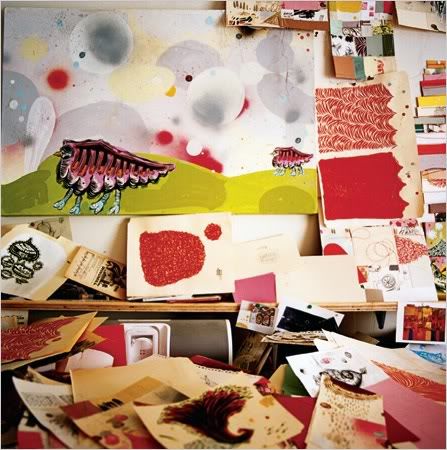
Thomas Campbell
Jus one piece of Campbell’s work on it’s own is formidable, but when you see a load of his work altogether, it is a different kettle of fish entirely! This image for instance shows piles and piles of experiments and ideas all over his desk, which is how it should be! An artists studio should be a complete pig sty with everything out and work all over the place…constantly reminding you of what you have to do and constantly reminding you of new ideas…and old ones you might have forgotten about. Looking at Campbell’s website, you know this is how he works because of the mass of work he has on there…and all quality stuff too!
Ben Javens – Mono Screenprint poster
Not amazing to look at admittedly as far as screen printing goes, but this piece means such a lot to me. Firstly, Ben Javens is a favourite artist of mine, and is a top bloke too! But, Mono, the Japanese Post-rock the poster advertises, are one of my all time favourite bands. The gig was the best gig I’ve been too. To have framed the print myself and to have it constantly reminding of me of such a lovely time is one of the best things a piece of art can do for me!